J.P. Morgan Private Bank
J.P. Morgan Private Bank
A White Glove Experience for High Net Worth Individuals
A White Glove Experience for High Net Worth Individuals
A White Glove Experience for High Net Worth Individuals
Overhaul the public site to increase lead gen and strengthen brand perception.
Squad
Code and Theory
UX Designer
Role
UX Designer
UX Designer
Timeline
May 2017 - Dec. 2017
Site
Responsibilities
Product Strategy
Content & UX Audits
Wireframing
Client Presentations
Workshop Leader
Stakeholder Interviews
Functional Annotations
Product Strategy
Content & UX Audits
Wireframing
Client Presentations
Workshop Leader
Stakeholder Interviews
Functional Annotations
Team Disciplines
Production
Creative Strategy
UX Design
Visual Design
Tech Development
Project Overview
1: Challenge
- Redesign the JP Morgan Private Bank site to position the bank as a thought leader within the industry
- Create an experience that feels white glove and generate new leads among high net worth individuals
- Design a system that is flexible and empowers editors to experiment with content
- Accommodate the varied needs of multiple stakeholders within the organization
- Refocus the client’s internal digital culture from siloed islands to a cohesive ecosystem
2: Approach
- Assisted with content and UX audits for 18 different sites, both in- and out-of-category
- Participated in 20+ stakeholder interviews, meetings, and client workshops
- Worked closely with strategy, design, and development to create product strategy goals and determine experience requirements
- Collaborated with strategy to determine site architecture, templates, modules, and features
- Created varying levels of wireframes, from hand-sketched to low- and hi-fidelity
3: Outcome
- Created a flexible, modular site that establishes JP Morgan Private Bank as a best-in-class digital experience and thought leader among high net worth individuals
- Restructured the digital ecosystem to position the Private Bank site as the focal point
- Influenced the internal workflow and mindset among the JPMPB digital team to be more collaborative and experimental
- Standardized the site experience with a simplified and intuitive site structure
- Created features that will increase qualified lead generation
Process

Market Research
Market Research
Market Research

UX & Content Audits
UX & Content Audits
UX & Content Audits

Stakeholder & User Interviews
Stakeholder & User Interviews
Stakeholder & User Interviews

Internal & Client Workshops
Internal & Client Workshops
Internal & Client Workshops

Office Embeds
Office Embeds
Office Embeds

Persona Creation
Persona Creation
Persona Creation
Where We Started
Like every blue moon or solar eclipse, working on a project from pitch to completion is rare. For the JP Morgan Private Bank site redesign, I had been a part of the project from the beginning, even before the project began. In May of 2017, we pitched against other top digital agencies for the opportunity to redesign their public-facing site and after we won it, realized that it wasn’t going to be that simple.
To kick off the project, our client briefed us with the following business goals:
Increase qualified lead generation
Deepen existing client relationships
Enhance brand perception
Amplify brand awareness
Previous Site Design
What We Discovered
• Market Research • Content & UX Audits • Stakeholder Interviews • Office Embeds •
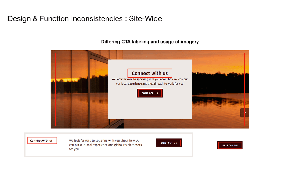
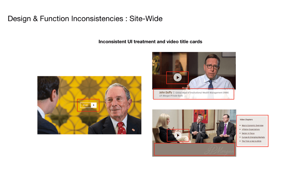
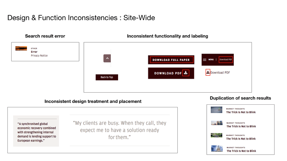
Through research, we found that the site lived within what can only be described (lovingly) as a rat’s nest of disparate, siloed platforms. From page to page, it presented inconsistent experiences, varied amounts of content (if at all), and gathered barely any analytics to make sense of how their users were interacting. It didn’t take long to discover that the Private Bank site didn’t just need a redesign, it needed a complete overhaul from the bottom up.
Content & UX Audits
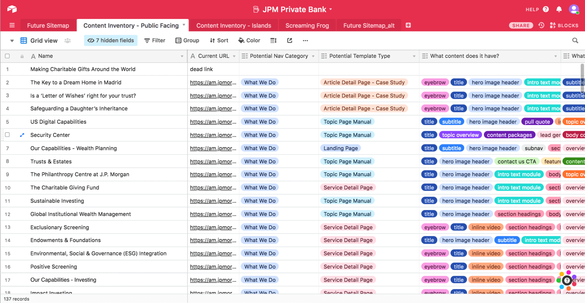
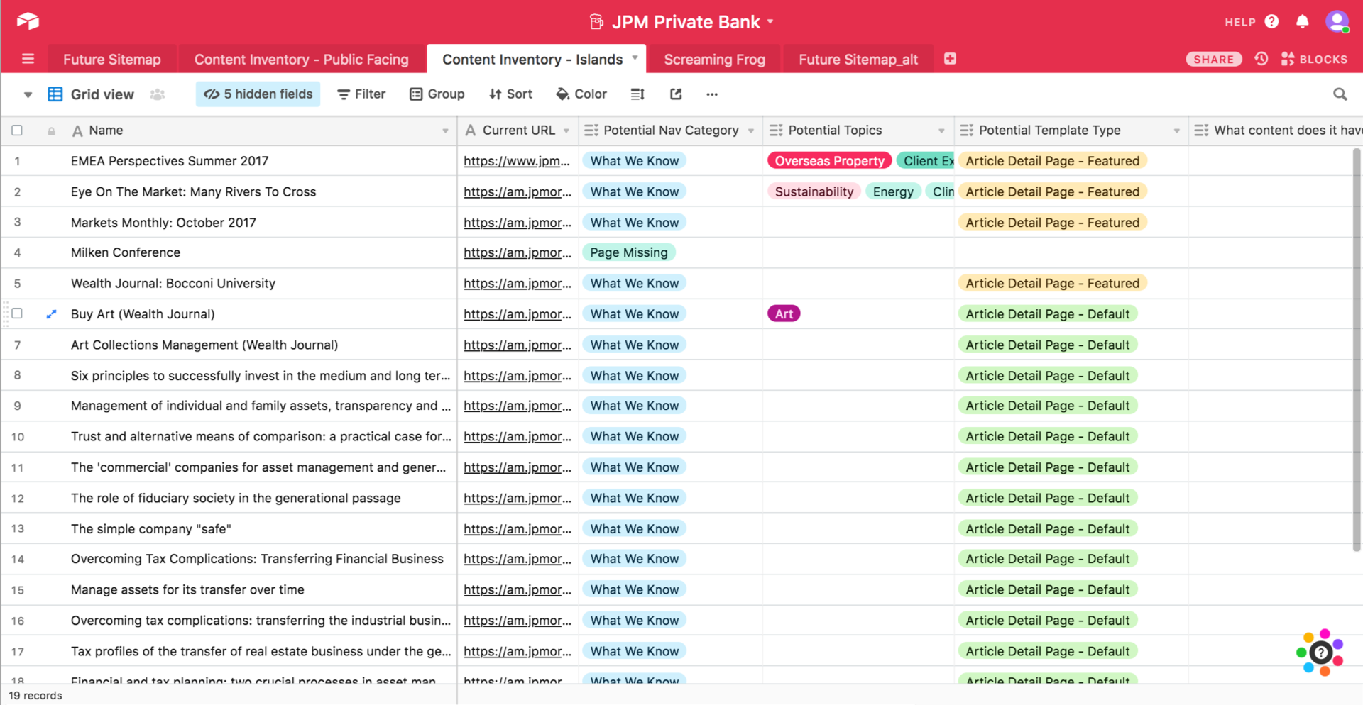
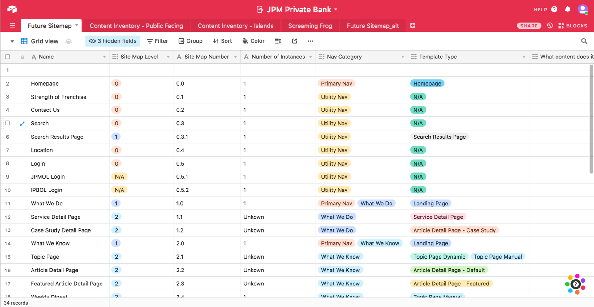
Audit Findings
Audit Findings
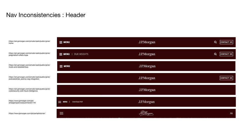
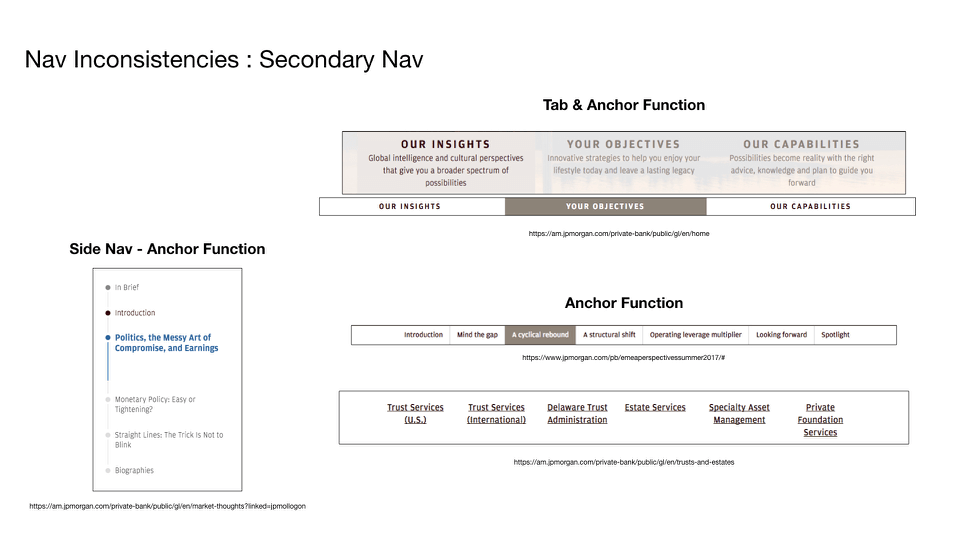
Through multiple interviews with stakeholders and site audits, we discovered there were huge barriers that needed to be overcome in order to make the overhaul successful:
- Few of our client stakeholders were fans of the site and everyone had differing opinions about its role within the Private Bank ecosystem
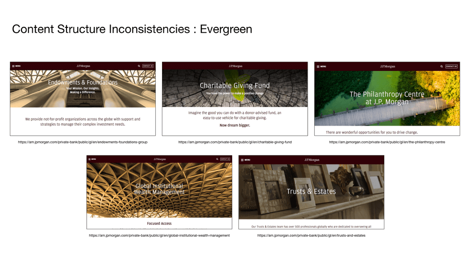
- Different regions of the company had gone rogue and created their own variations of the Private Bank site
- No official content strategy existed and thought leaders within the organization were not writing their content according to any particular template or standard
- The taxonomy was not robust enough to support the needs of the site and in correlation, the SEO was underwhelming
- The development team did not have a system in place to allow for the use of templates and instead were hardcoding each page as the site grew
- There were concerns about where we would be getting content to populate the new site and whether or not the content team would be able to keep the pace.
- And lastly, the digital brand identity offered little space for visually engaging content and design (read: all brown everything)
Our Approach
• Internal & Client Workshops • Sketches • Lo- & Hi-Fi Wireframes • CRD Creation •
• Internal & Client Workshops • Sketches • Lo- & Hi-Fi Wireframes • CRD Creation •
• Internal & Client Workshops • Sketches • Lo- & Hi-Fi Wireframes • CRD Creation •
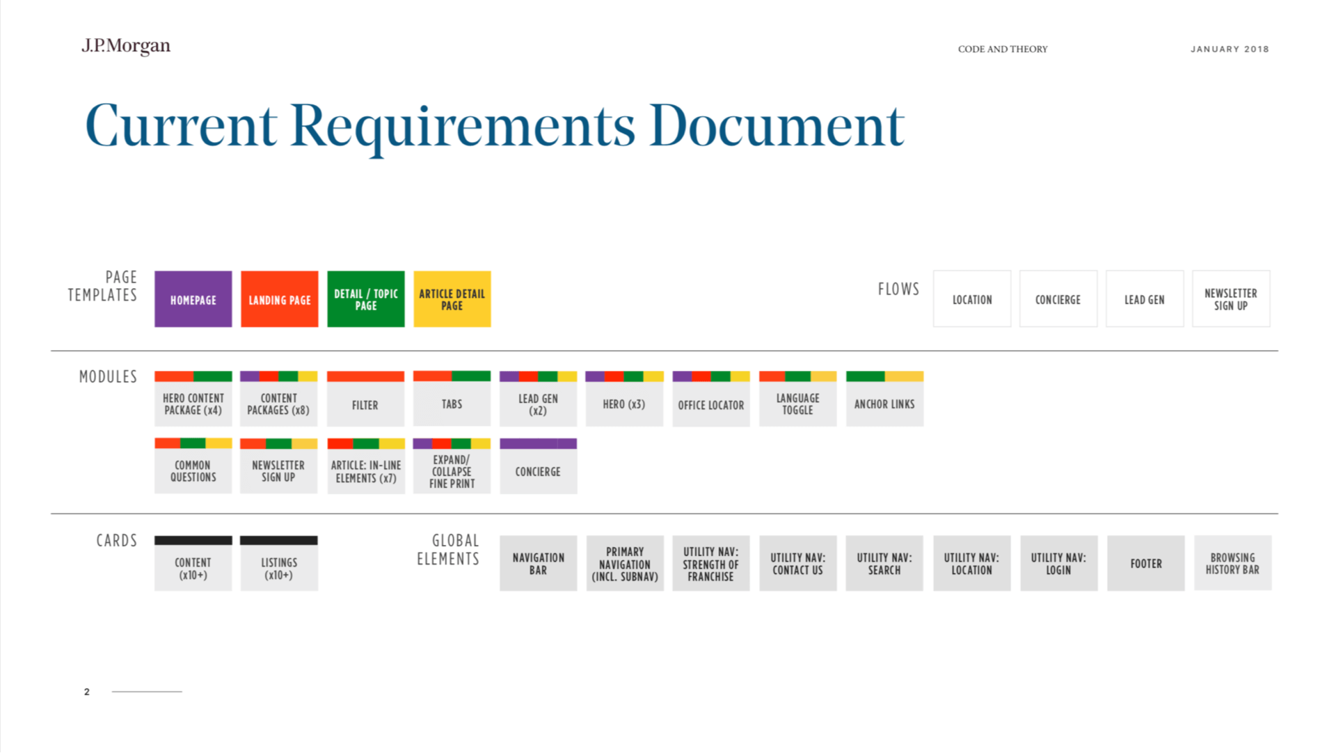
With these findings in mind, our final strategies for the project were: to shift the entire digital culture within the organization, starting with their public site; develop a legitimate audience by increasing data collection in order to get better leads; and to beef up their editorial efforts in order to turn their site into a destination for thought leadership.
War Room Workshops
War Room Workshops
To support these strategies, we: built a templated system capable of flexing up or down based on content needs; worked closely with the editorial team to establish a content strategy that aligned with the new site goals; streamlined the site architecture to become more intuitive; created tailor-made modules to increase lead generation while simultaneously building the site’s audience; and built it all within a CMS that would allow the development teams to create pages with greater efficiency and speed.
When it launches in early 2019, this site redesign turned company overhaul will represent the beginning of a new standard for the JP Morgan Private bank and their digital products going forward. •
Sketches
Sketches
Lo-Fi Wireframes
Lo-Fi Wireframes
Hi-Fi Wireframes
Hi-Fi Wireframes
Hi-Fi Wireframes
Final Design
Final Design

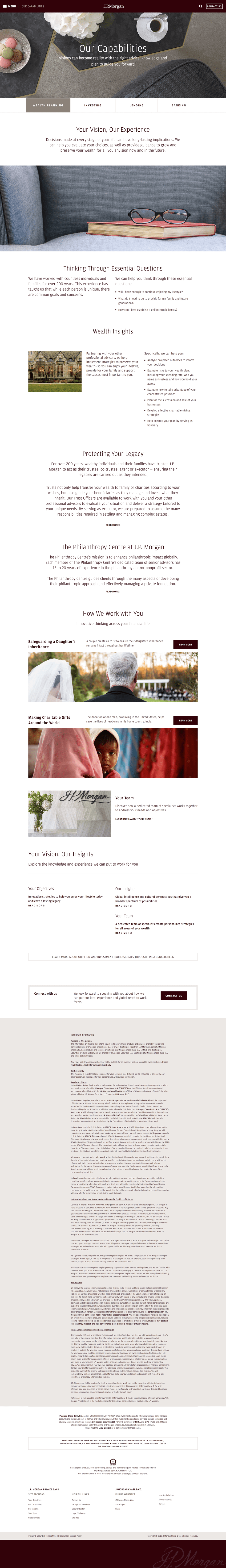
Design Decisions
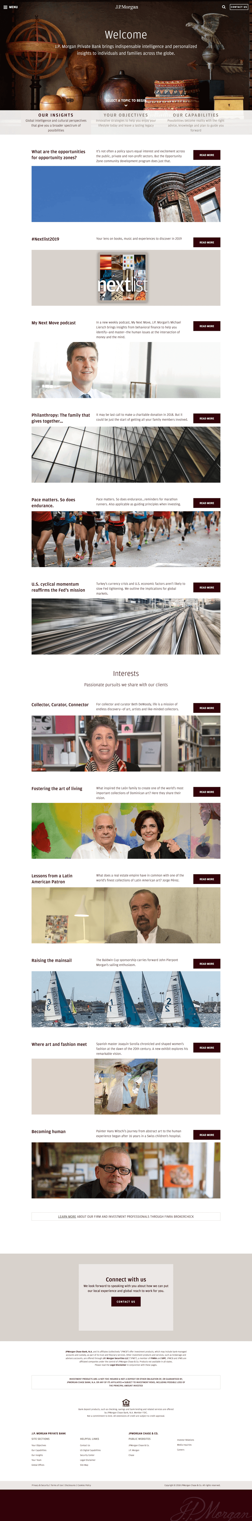
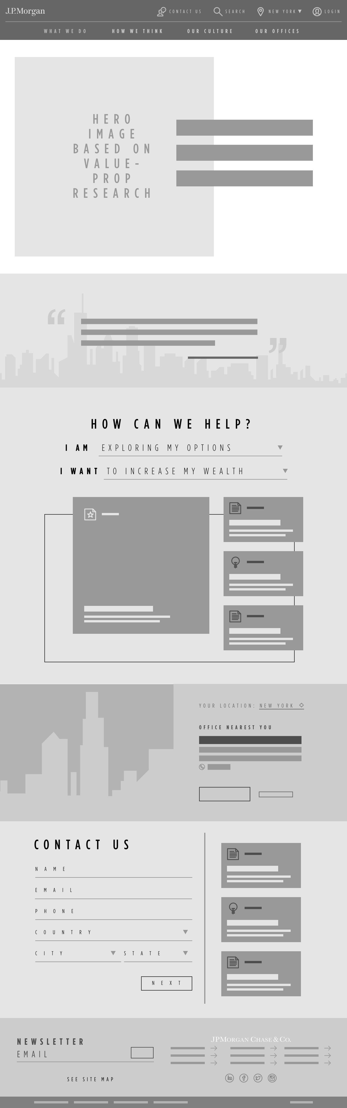
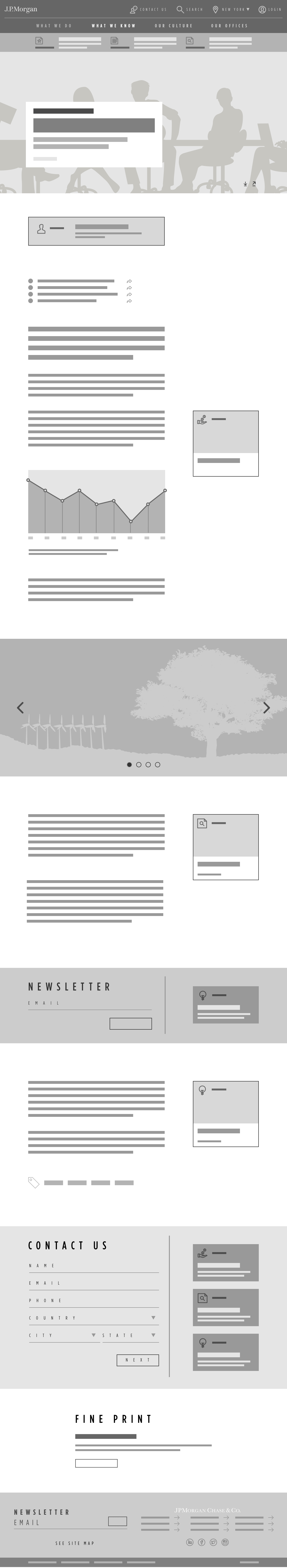
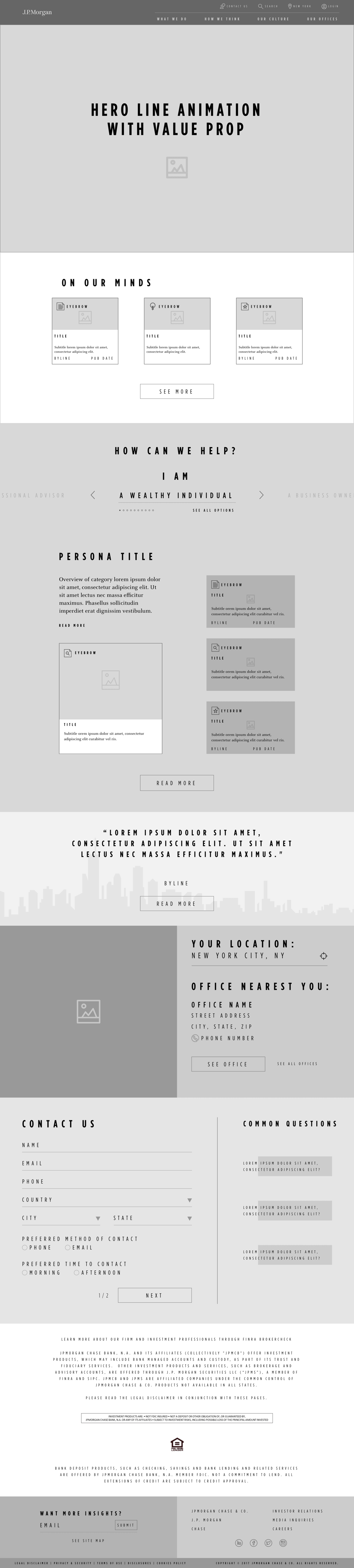
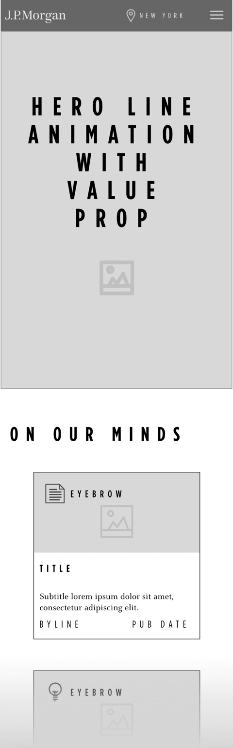
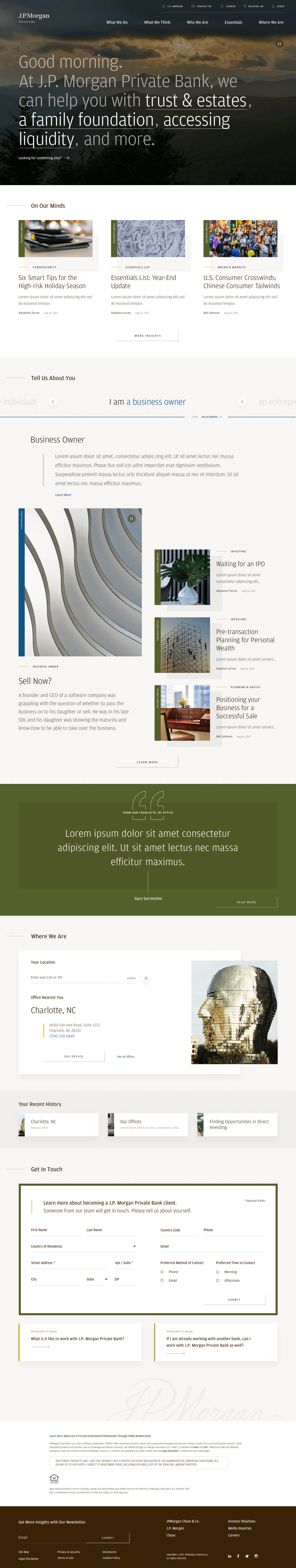
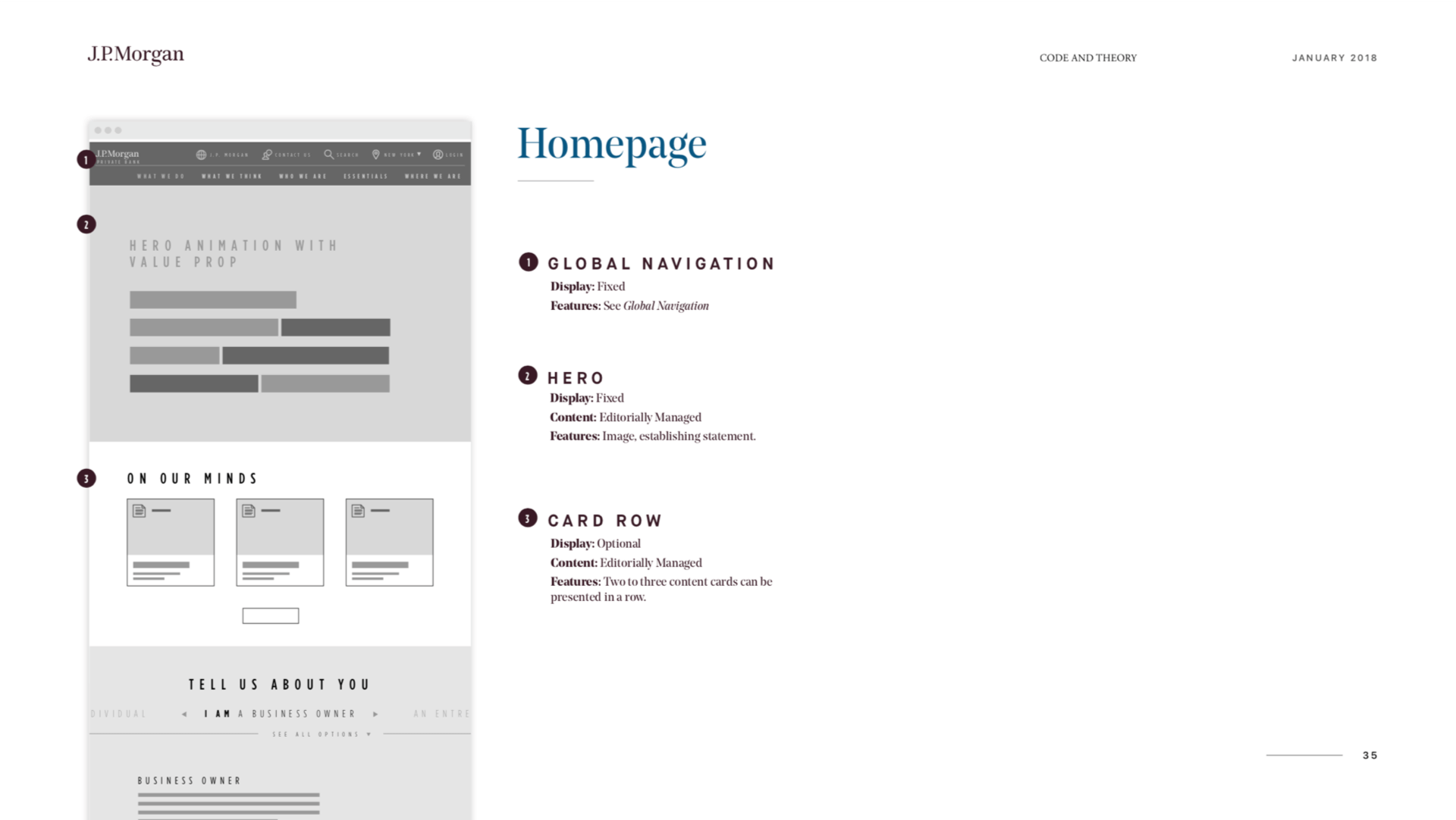
Homepage Hero
For this feature, I wanted users to experience what it might be like to walk into a Private Bank office and be greeted by a financial advisor. On landing, users are contextually greeted based on the time of day, while also being introduced to dynamic products and services of the bank.
On rollover, these dynamic links display by themselves with brief descriptions to help incentivize click-through. Lastly, a looping background video is displayed based on the user’s location to help reinforce the Private Bank’s global presence and make the experience feel personalized.
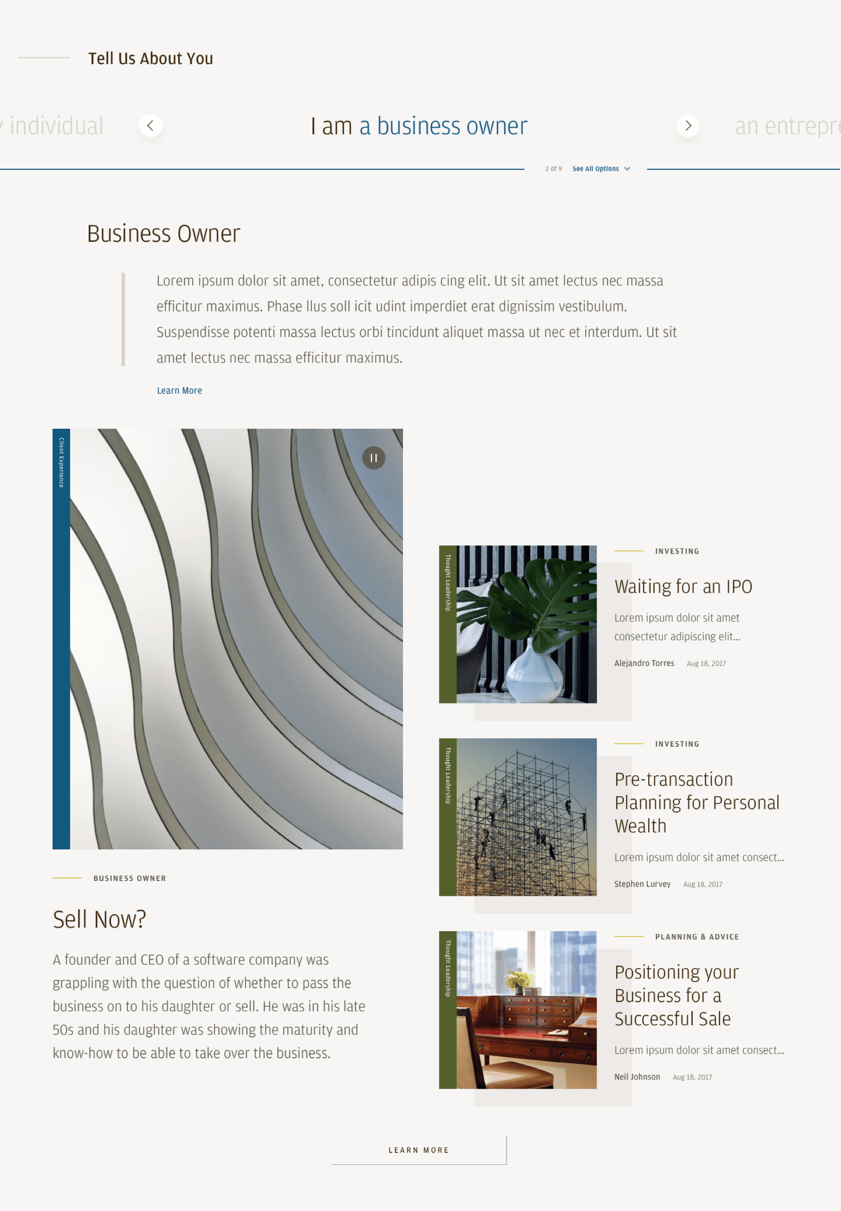
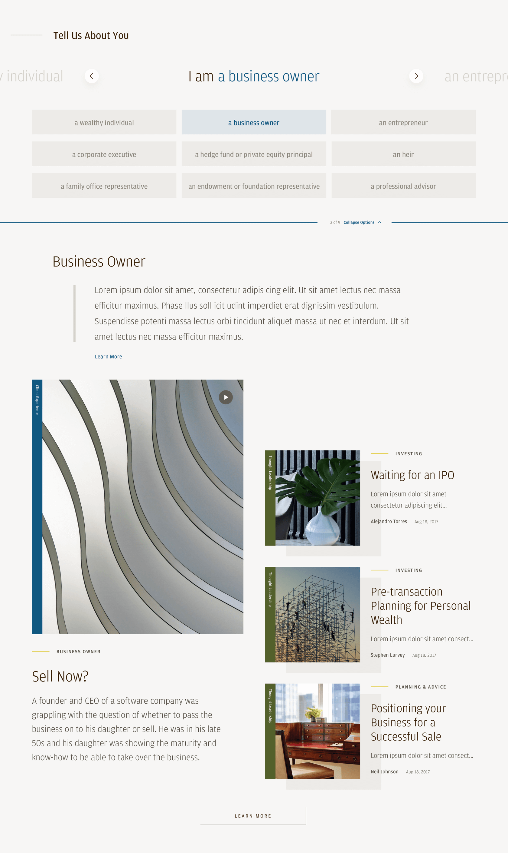
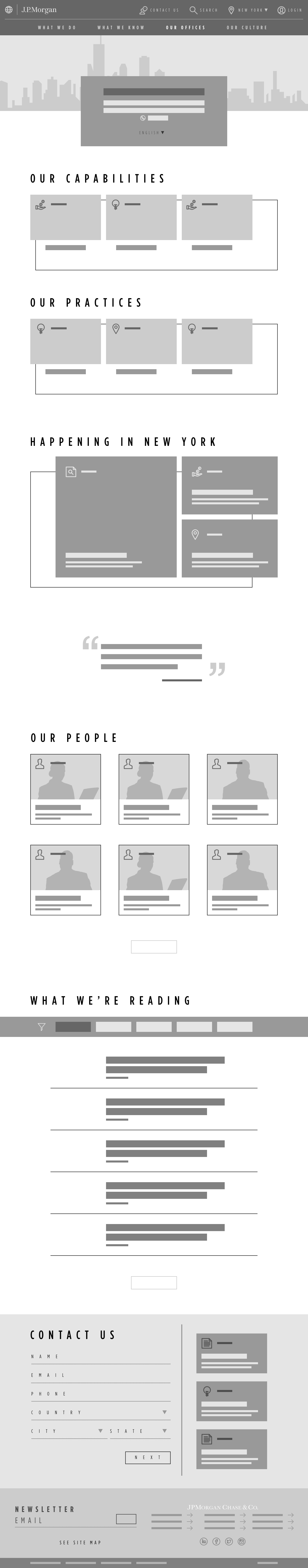
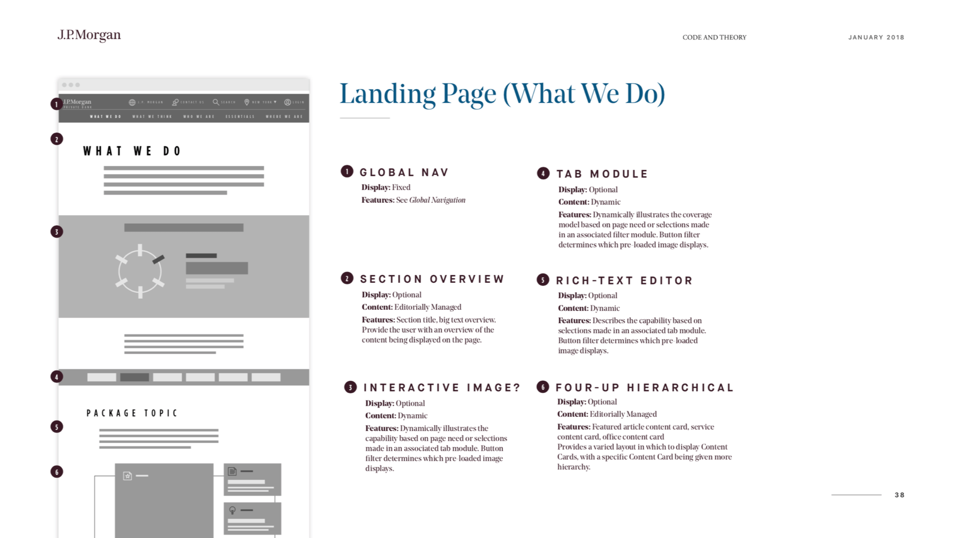
Concierge Module
This feature accomplished two design challenges, which were to surface content that users are searching for, while also helping to grow the site’s audience data. Users self-identify from a variety of different client types and are then presented with a brief description of the client type from the Private Bank’s perspective.
Additionally, related case studies, products, and thought leadership are displayed to coincide with the client type.
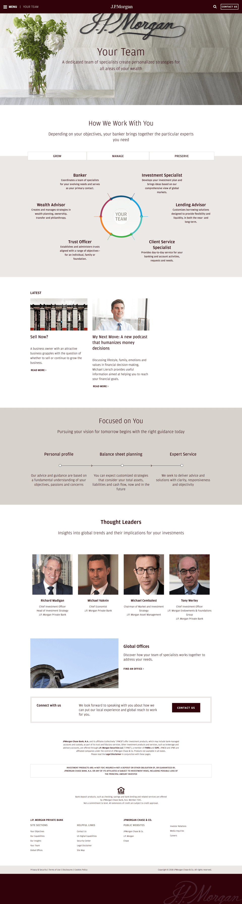
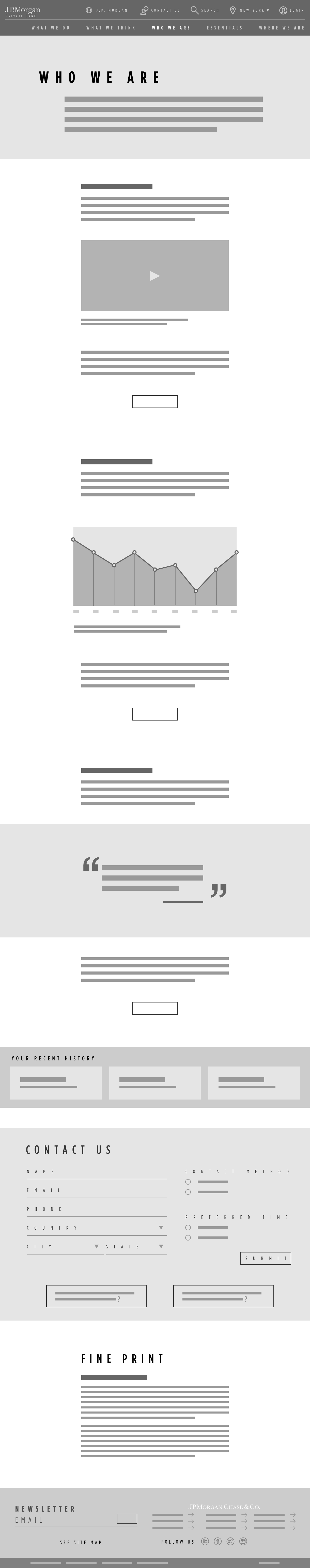
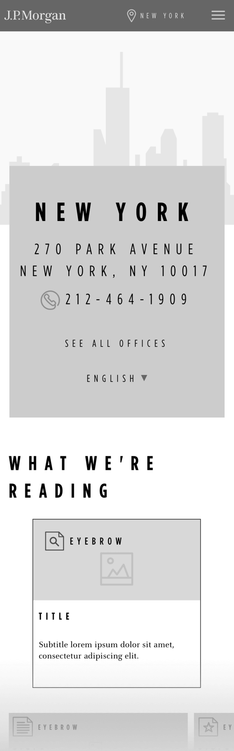
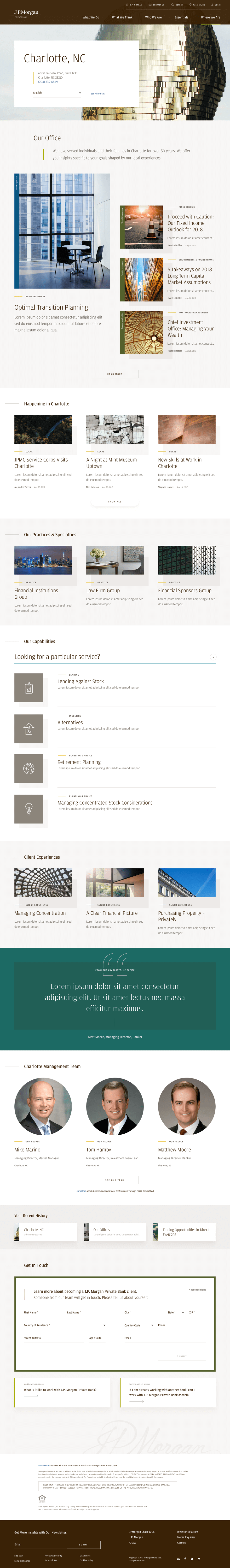
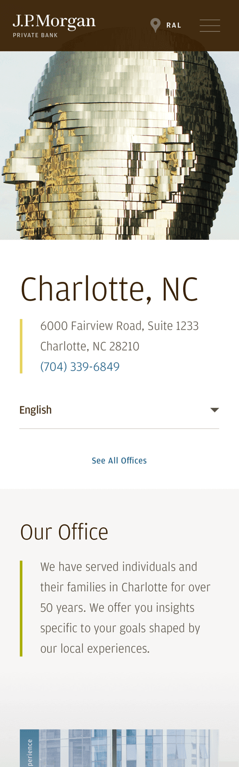
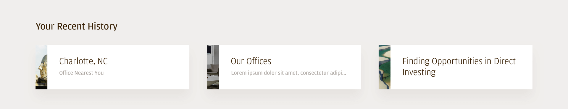
Page History Drawer
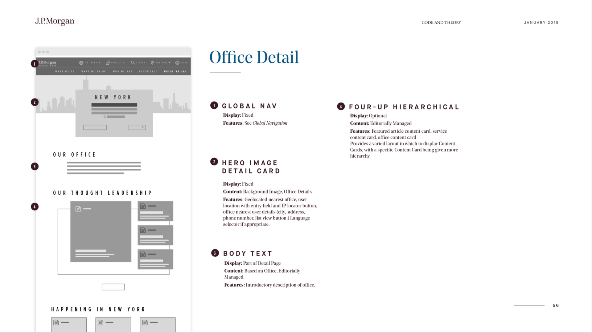
To accommodate for the majority of users who come into sites from a side door link rather than the homepage, a Page History Drawer pinned to the bottom of the viewport keeps track of users’ last 3 viewed pages. This makes it easier for them to return to content they were looking for initially.
For users that come into the site through an office detail page, that page remains displayed in the drawer for the duration of the session. This helps users to more quickly return to the page in search of contact information.


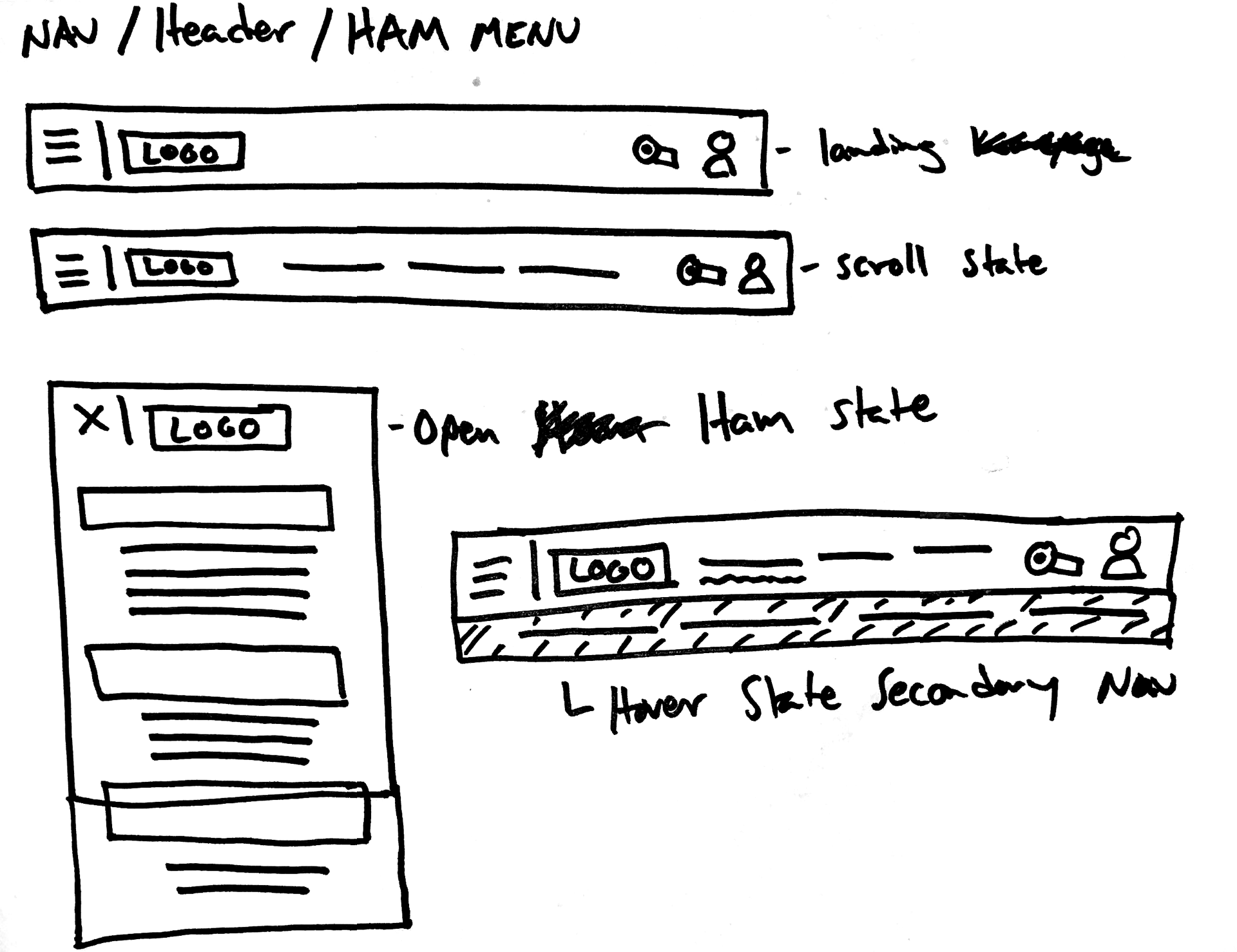
Utility Navigation
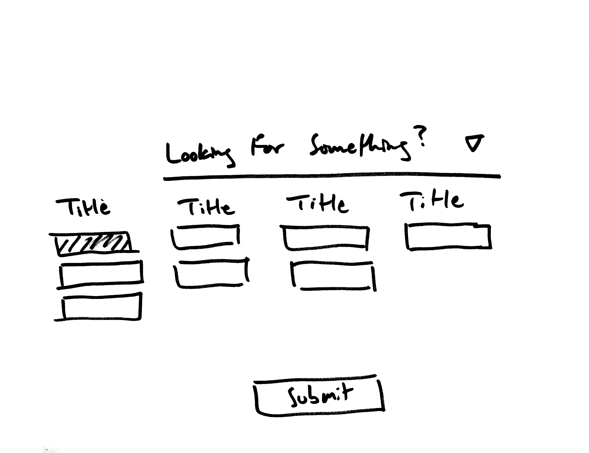
Wanting to make the navigation do more than display the site directory, we included utility links that cause an additional level of the navigation to display.
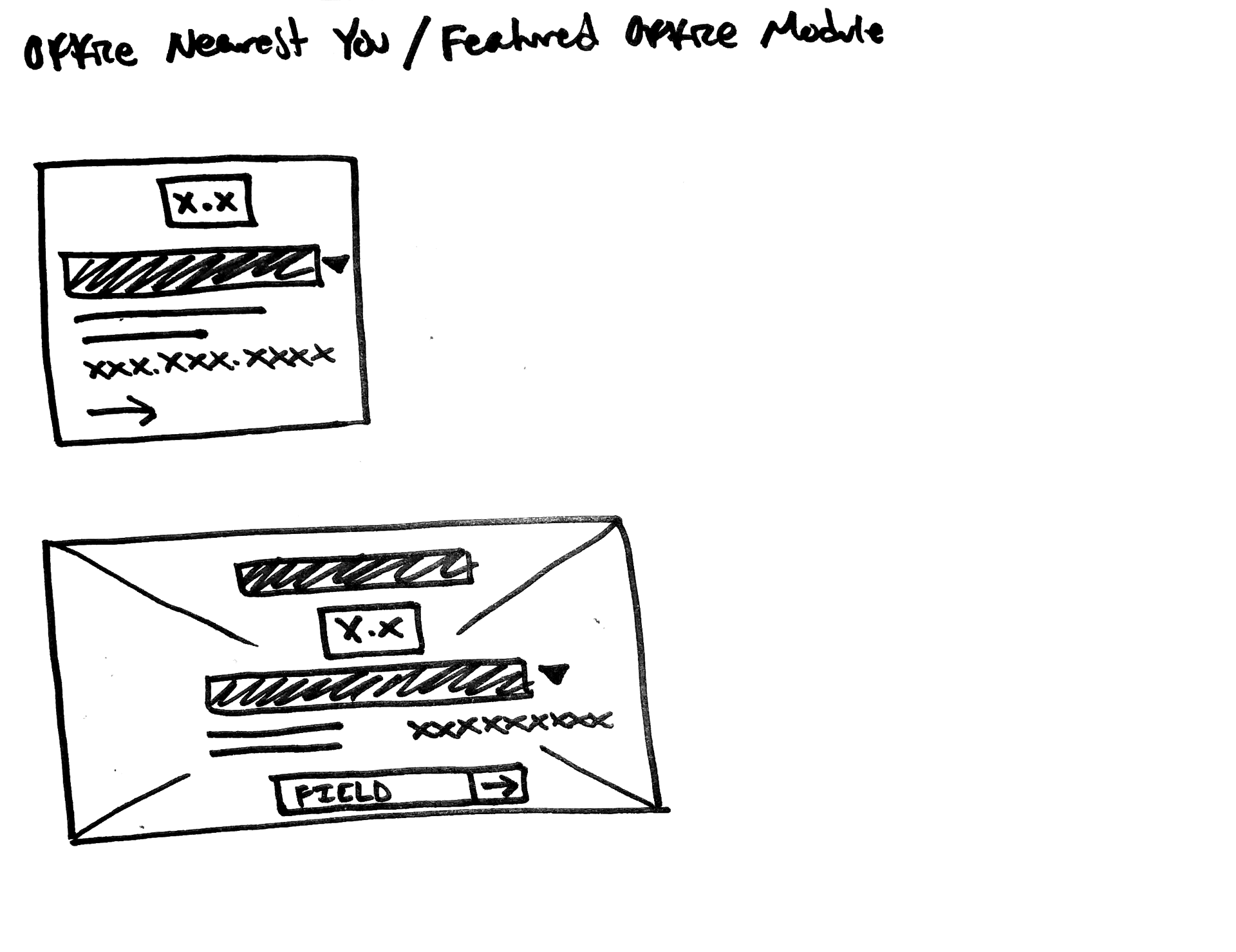
The utility links provide persistent access to the banks’ strength of franchise offerings, lead generation, predictive & suggested search, nearby office details, and links to external log-in portals.
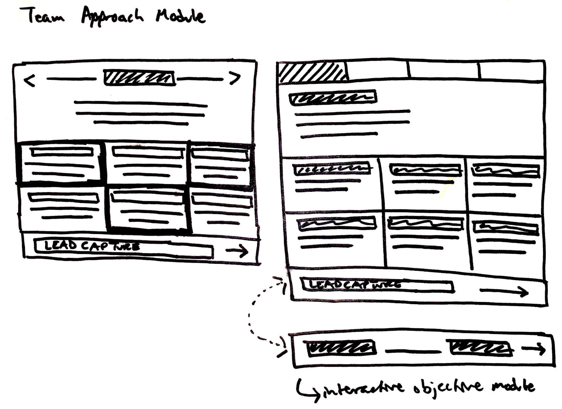
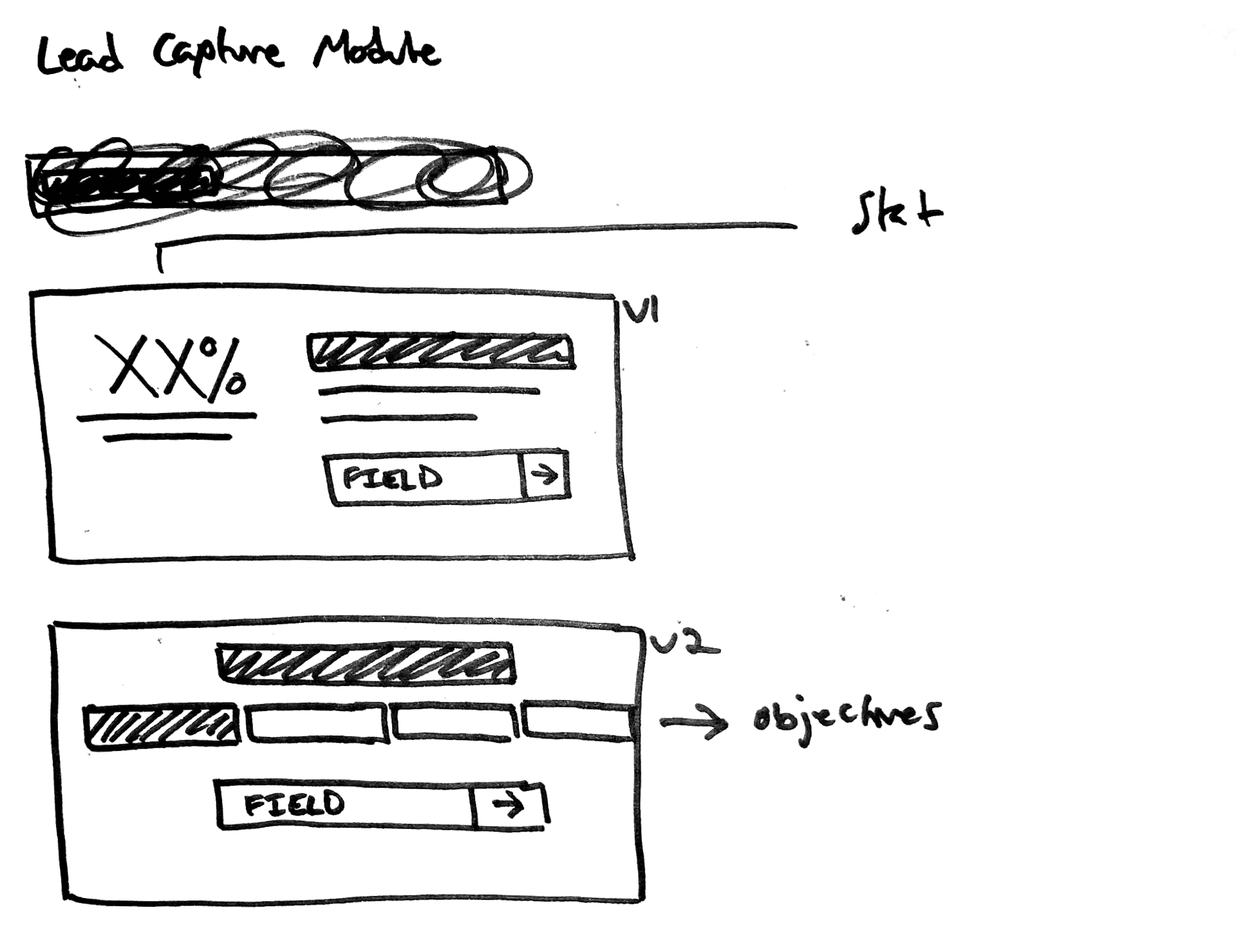
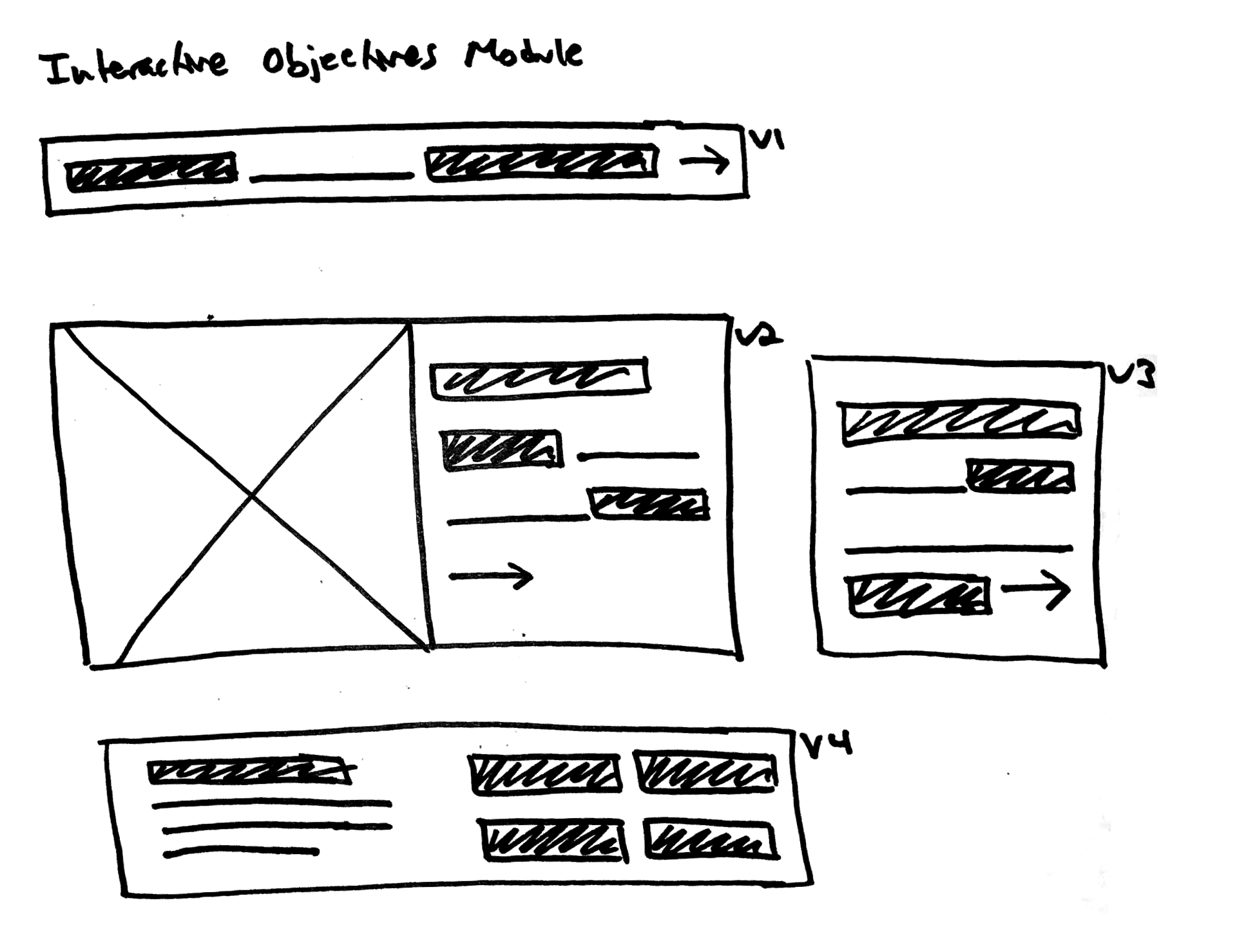
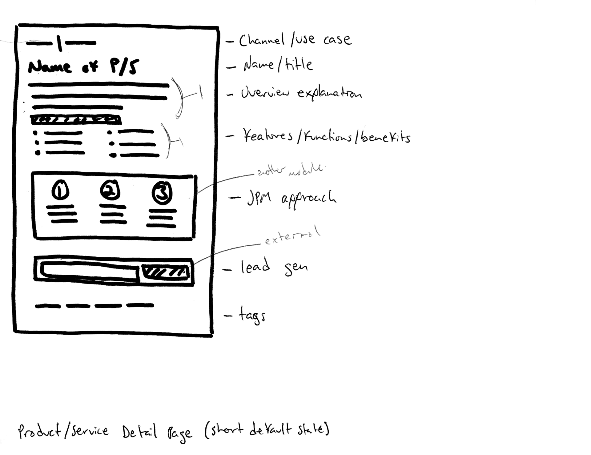
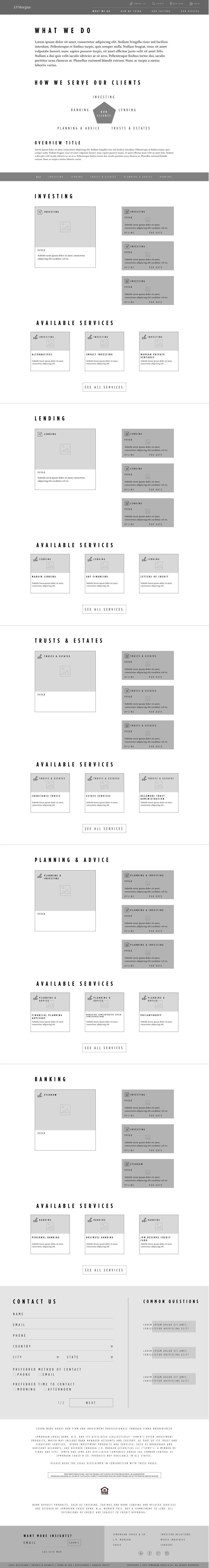
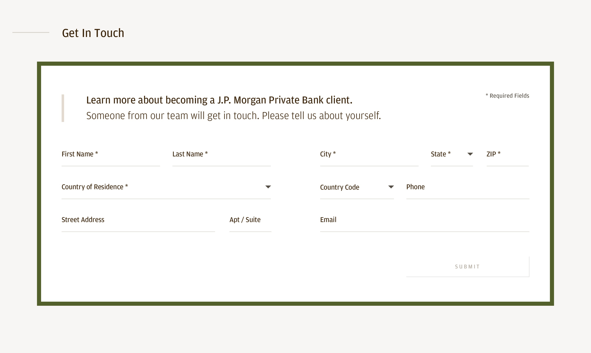
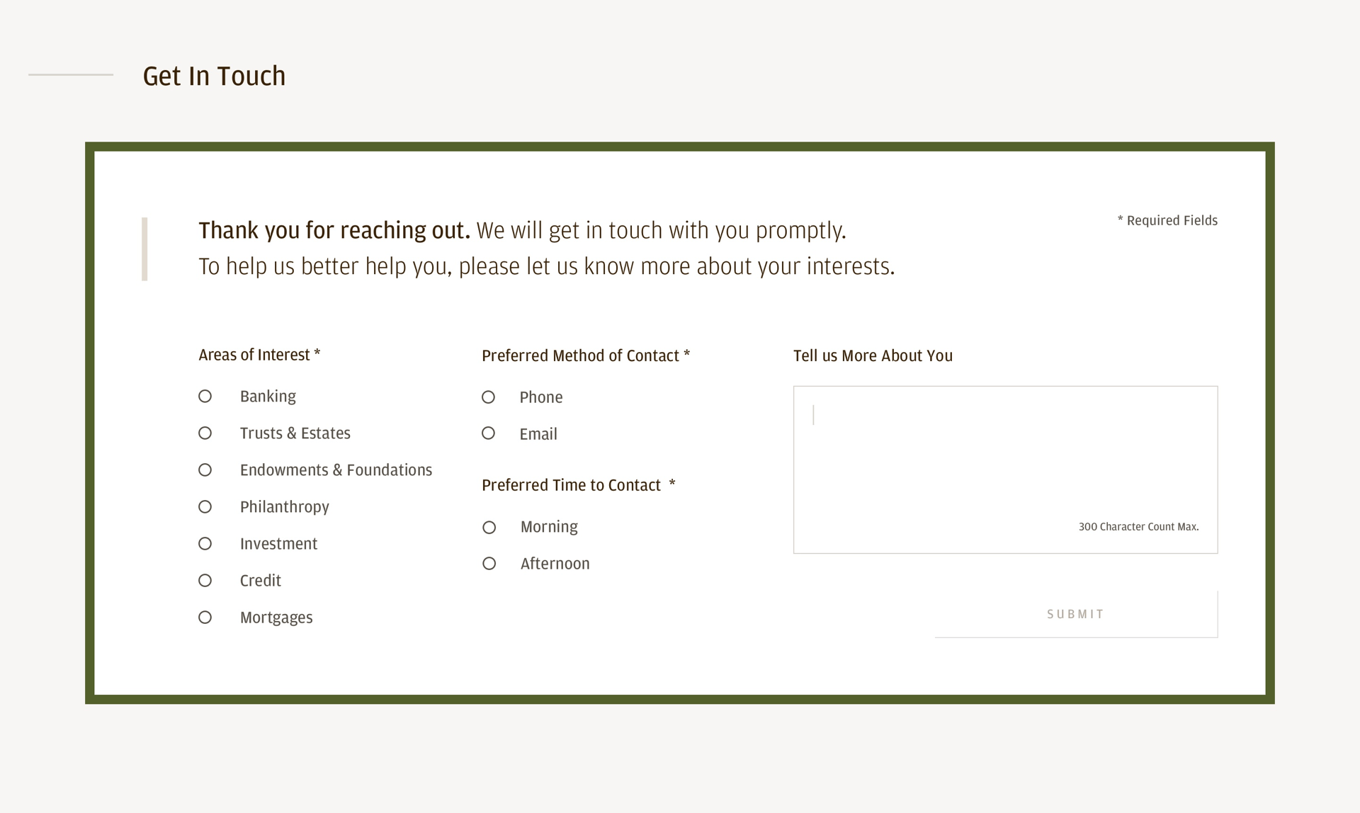
Lead Gen Module
The Lead Generation module is a two-stepped process that accommodates for low and high involvement users. For those who simply want to submit basic contact information, that option is available, while also offering other users the ability to indicate areas of interest, and to specify how and when they are contacted.
This benefits both the bank and the user by increasing lead opportunities and data collection, while streamlining the conversation process and getting users in touch with the right people.
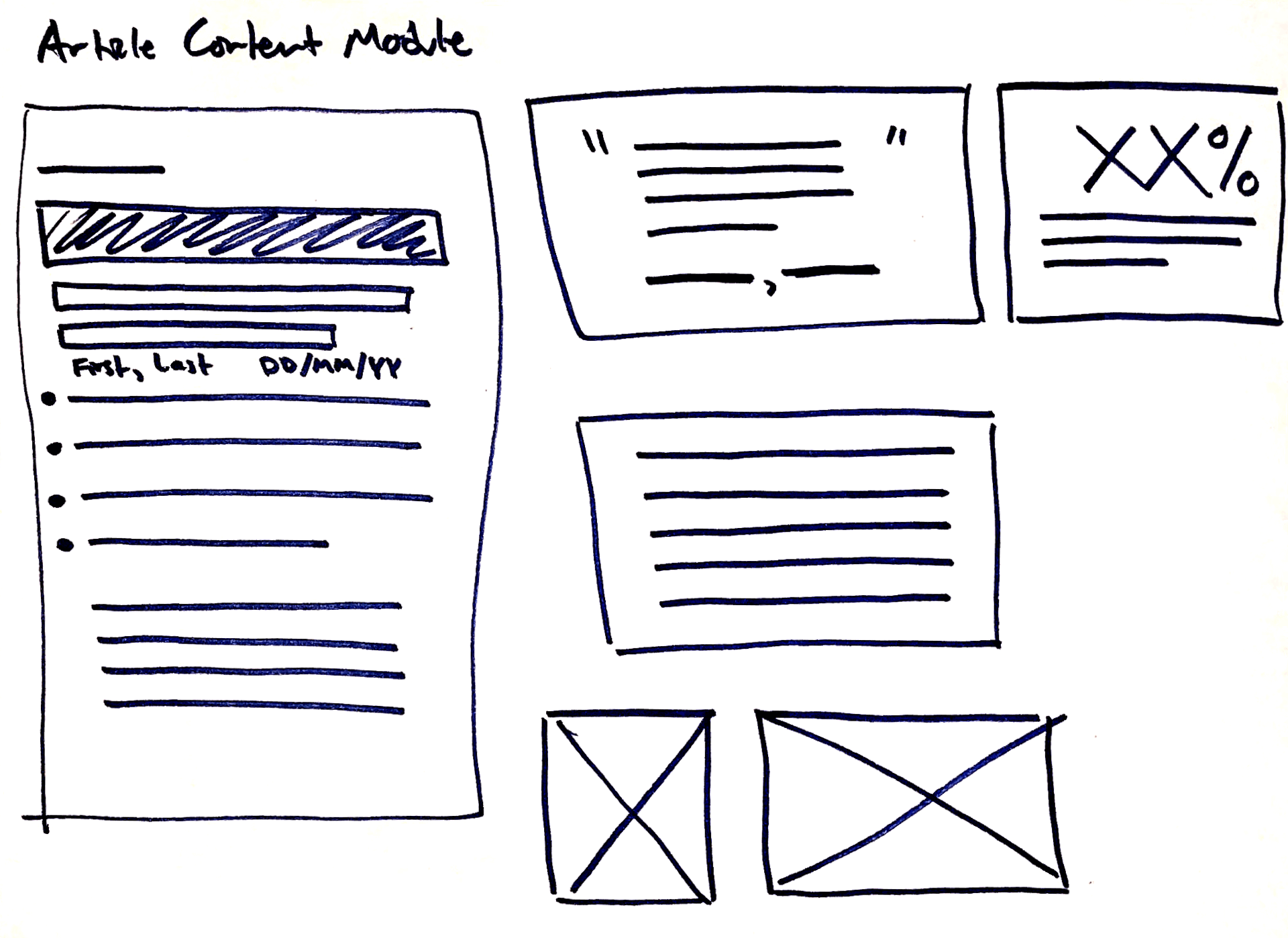
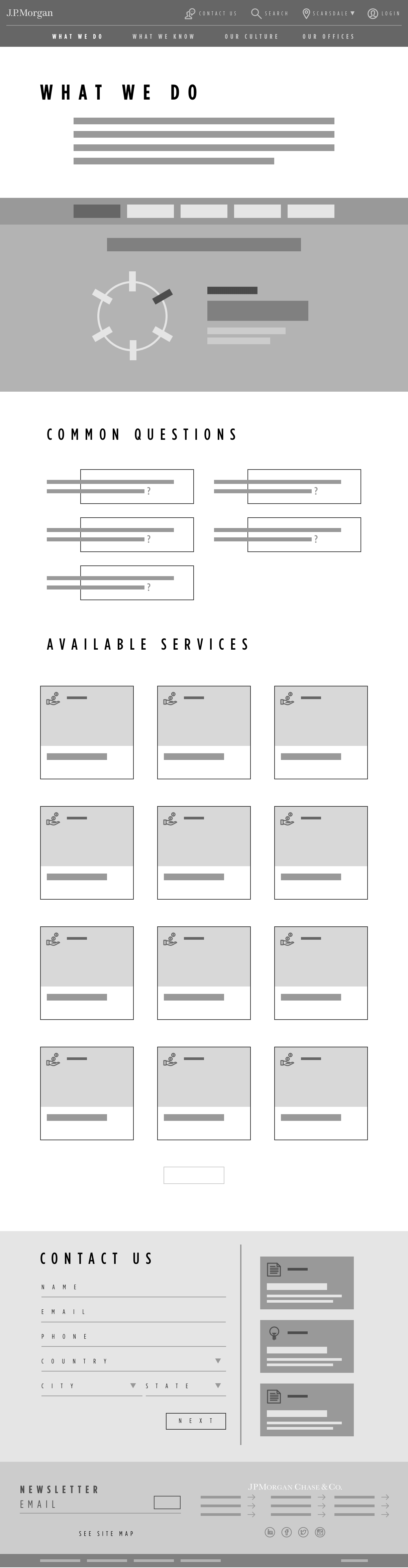
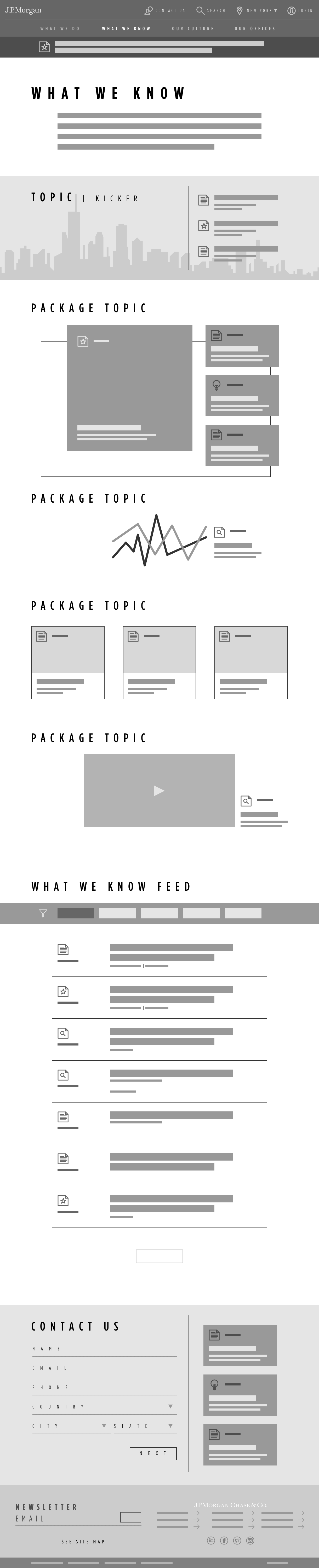
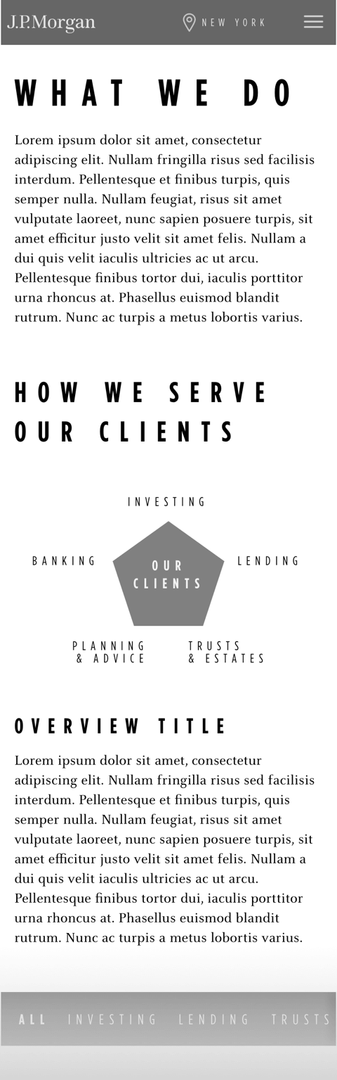
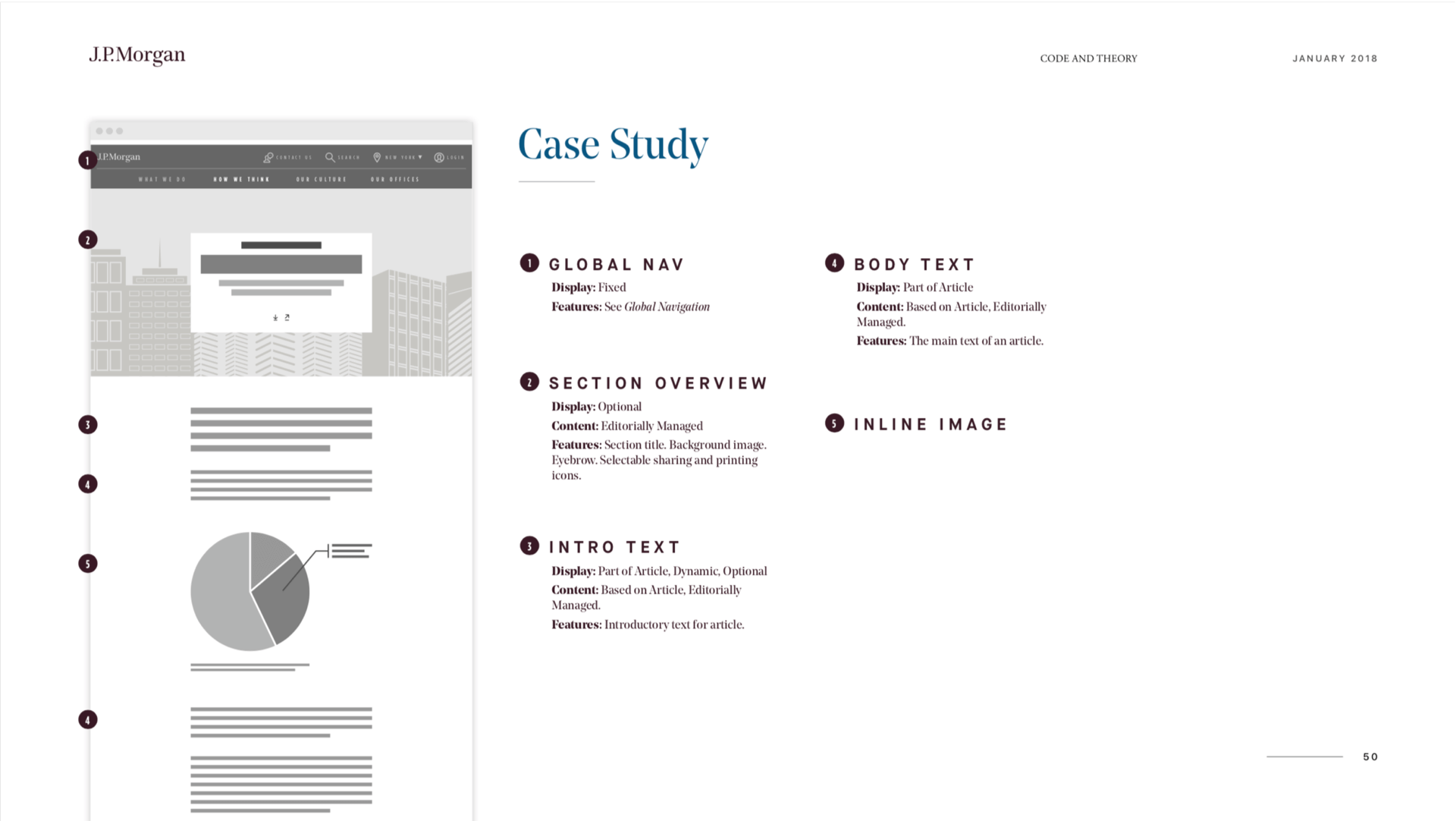
Article Toolkit
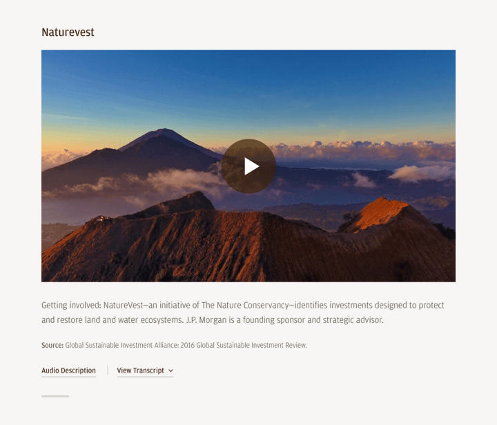
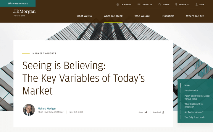
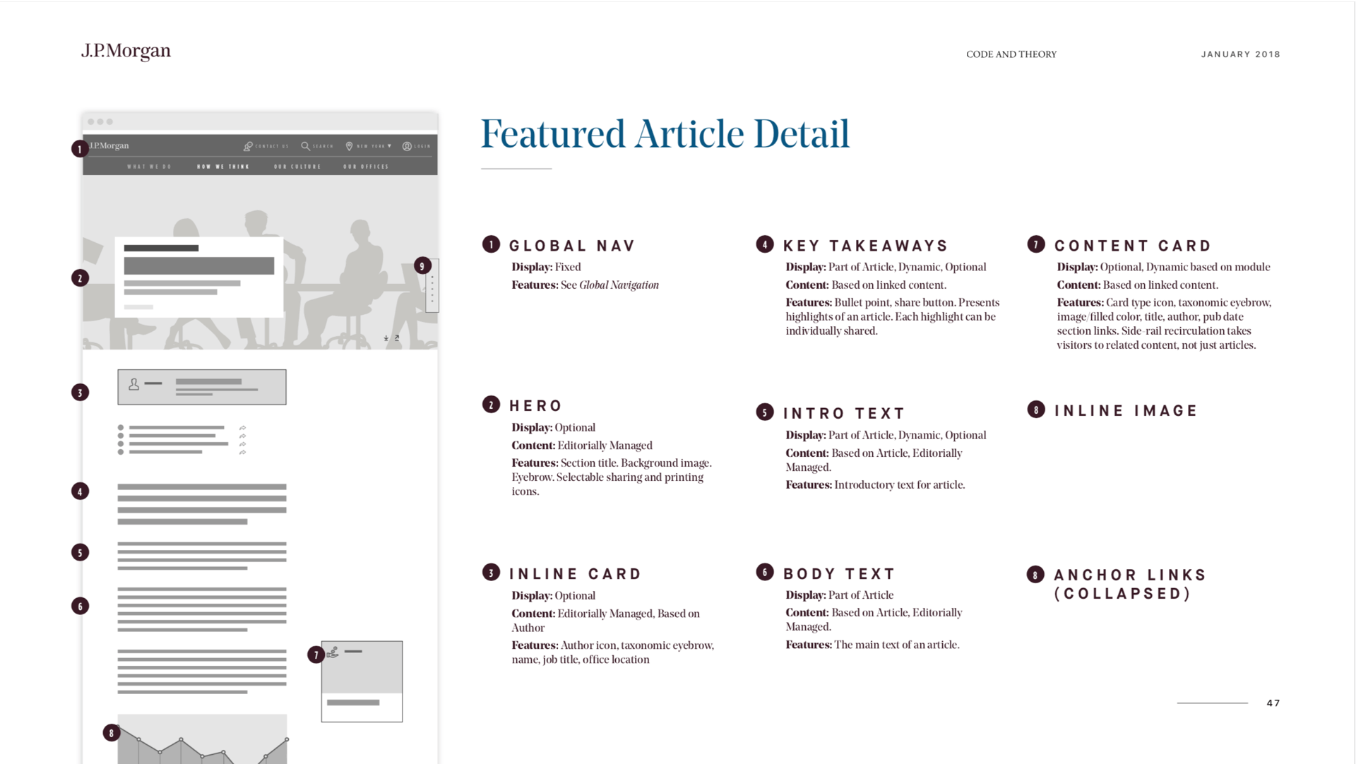
The article toolkit was designed to keep content fresh with module types such as carousels, videos, quotes, charts & graphs, and copy. Each article displays with shareable key takeaways featured at the top to help time-poor users and increase traffic to the page. Every article is downloadable, which extends the shelf-life and reach of the content. Content tags are displayed at the bottom of the page to help drive traffic to corresponding topic pages, and a recirculation gutter displayed alongside the article provides a side door to additional related content.

Documentation
Squad
Code and Theory
Joe Curcio
Senior Producer
Senior Producer
Matt Chmiel
Associate Director of Creative Strategy & Co-Project Lead
Associate Director of Creative Strategy & Co-Project Lead
Alexis Baran
Creative Strategist
Creative Strategist
Peter Gallo
UX Director & Co-Project Lead
UX Director & Co-Project Lead
Thomas Strickland
Associate UX Director
Associate UX Director
Viviana Flores
Junior UX Designer
Junior UX Designer
Rob Bigwood
Associate Visual Design Director
Associate Visual Design Director
Jae-Won Choi
Visual Designer
Visual Designer
Oscar Diaz
Tech Director
Tech Director
Kory Rozich
Junior UX Designer
Junior UX Designer
My Role
One of two team members who was on the original pitch team
One of two team members who was on the original pitch team
Participated in stakeholder interviews and aided in content and UX audits for 18 different sites
Regularly presented and championed UX and visual designs during client reviews using Invision prototypes
Lead internal workshops to push creative concepts and features
Was the lead UX designer for most deliverables (sketches, wireframes) and provided oversight for the func spec
Worked collaboratively between strategy, design, and development to define, design, and build the site
Kory Rozich © 2020 - All Rights Reserved
Kory Rozich © 2020 - All Rights Reserved
Kory Rozich © 2020 - All Rights Reserved
Kory Rozich © 2020 - All Rights Reserved
Kory Rozich © 2020 - All Rights Reserved

